SAMSUNG
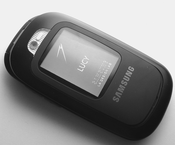
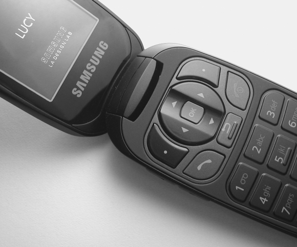
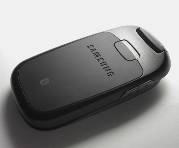
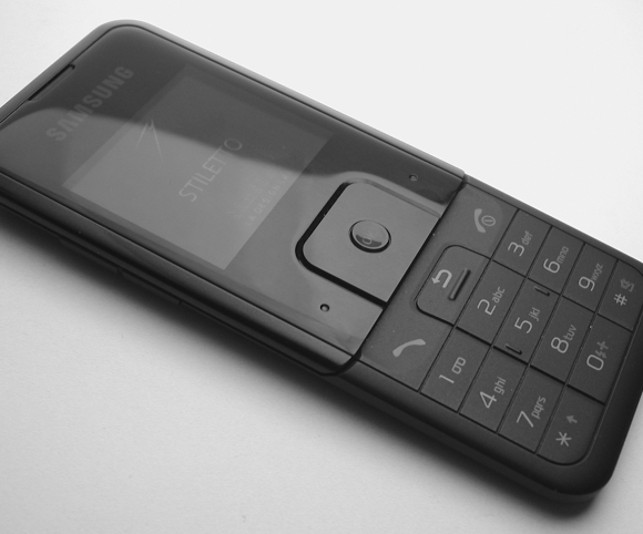
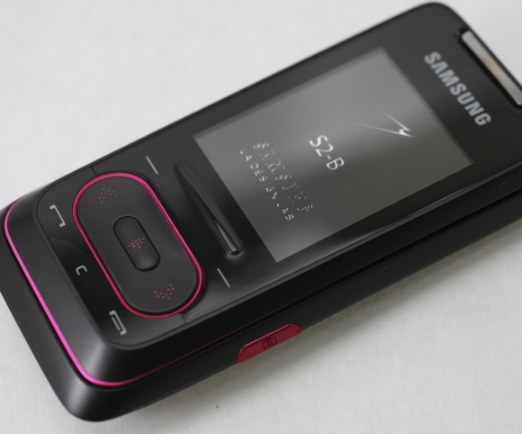
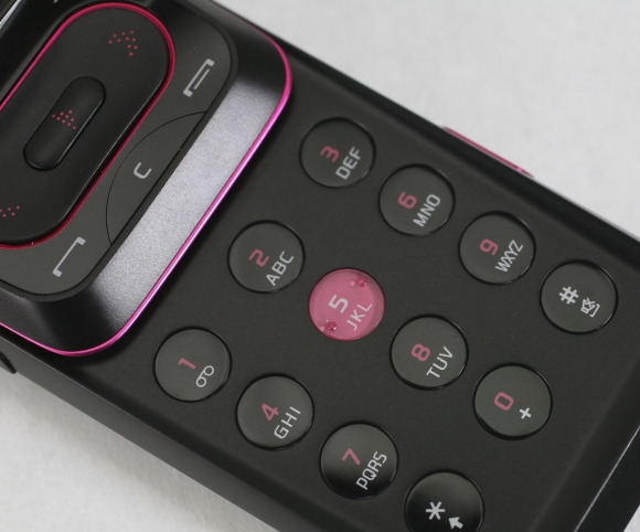
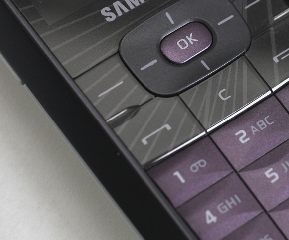
From 2005 – 2007 I worked with at Samsung’s Los Angeles LAB. The purpose of the LAB was to generate design proposals that carried the Samsung brand forward into the North American market. While there I worked on a number of programs that addressed gaps in the company portfolio.
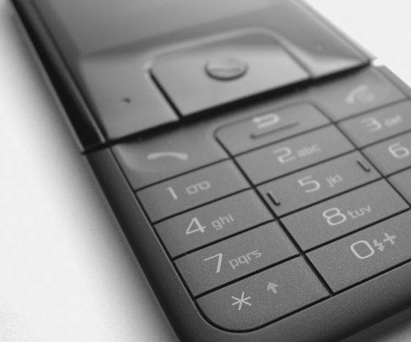
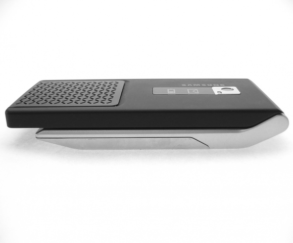
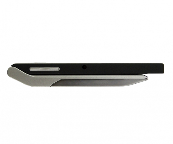
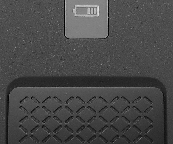
The images at left are from various programs. They explore issues of tactility, visual rhythm, and most importantly — expanding the Samsung brand look & feel into new visual territories while remaining rooted firmly in the company’s DNA.
WHY I LIKE IT:
This work was done just as touch was emerging as a viable solution in the category, and while touch was incorporated in some of these designs (captive keypads, hover states, etc.) this was a time when keyboard was still king and composition and rhythm was a decisive factor in creating design appeal.