SAMSUNG DREAMING
CLIENT: SAMSUNG
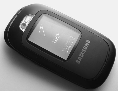
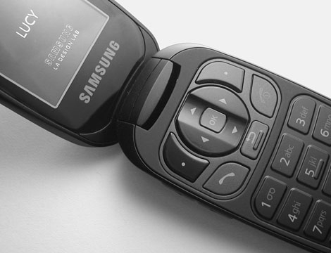
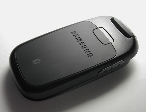
From 2005 – 2007 I worked at Samsung’s Los Angeles LAB. The purpose of the LAB was to generate design proposals that carried the Samsung brand forward into the North American market. While there I worked on a number of programs that addressed gaps in the company portfolio.
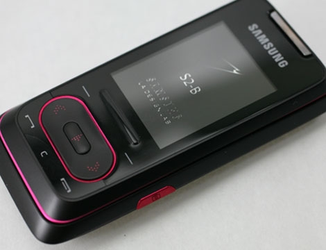
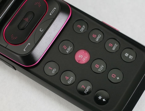
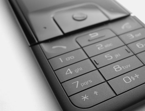
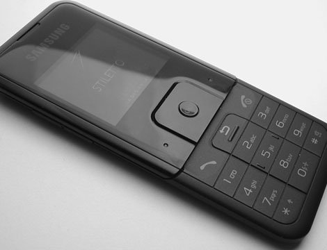
The images at left are from various programs. They explore issues of tactility, visual rhythm, and most importantly — expanding the Samsung brand look & feel into new visual territories while remaining rooted firmly in the company’s DNA.
WHY I LIKE IT:
This work was done just as touch was emerging as a viable solution in the category, and while touch was incorporated in some of these designs (captive keypads, hover states, etc.) this work explores how keyboard composition, key cap tactility, and form factor factor combine to create an understanding of the object as well as its appeal.