FROM THE ARCHIVES
CLIENT: SONY
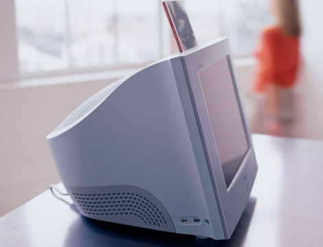
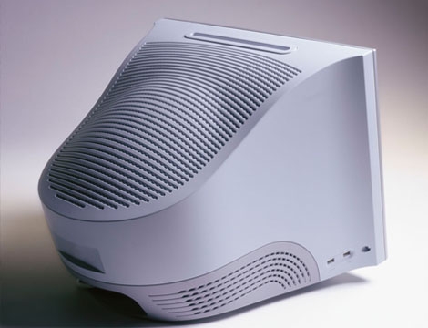
This monitor was done in 1999 for Sony while I was working at LUNAR design. Sony had developed a ‘flat’ CRT technology which they wanted to introduce to the home market. ‘Flat’ was a relative term; in reality the front glass had a very shallow curvature that gave the impression of being flat. In the days before flat displays became common place large bulky CRTs ruled the landscape.
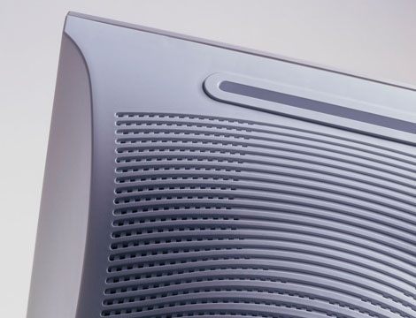
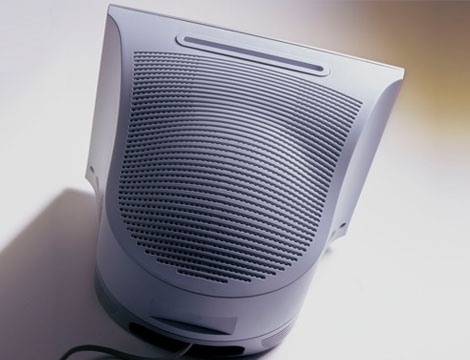
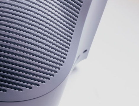
My inspiration for this design came from two core insights: 1. the front of the display should be all about flatness, offering the user a picture frame and little else. 2. the back of the unit, the part we all try to hide – should be the most attractive part of the design.
It seemed to work well.
WHY I LIKE IT:
Keeping the front surface all business while elevating the perception of the rear housing was a smarter insight than I realized at the time. I still run into this monitor on occasion which always brings a smile to my face.